• Visual Design • Typography
Overview
Role: Visual Designer
Solo project for Typography Class
Duration: 2 weeks
Solo project for Typography Class
Duration: 2 weeks
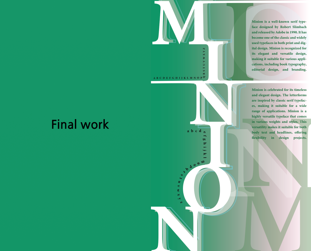
About this project: This project focuses on the design and development of posters that highlight the versatility and elegance of the Minion typeface. The aim was to explore its typographic characteristics, from its serif structure to its adaptability across various design applications. Through a combination of visual hierarchy, spacing, and balance, the posters serve as an engaging introduction to Minion for both casual viewers and design enthusiasts.
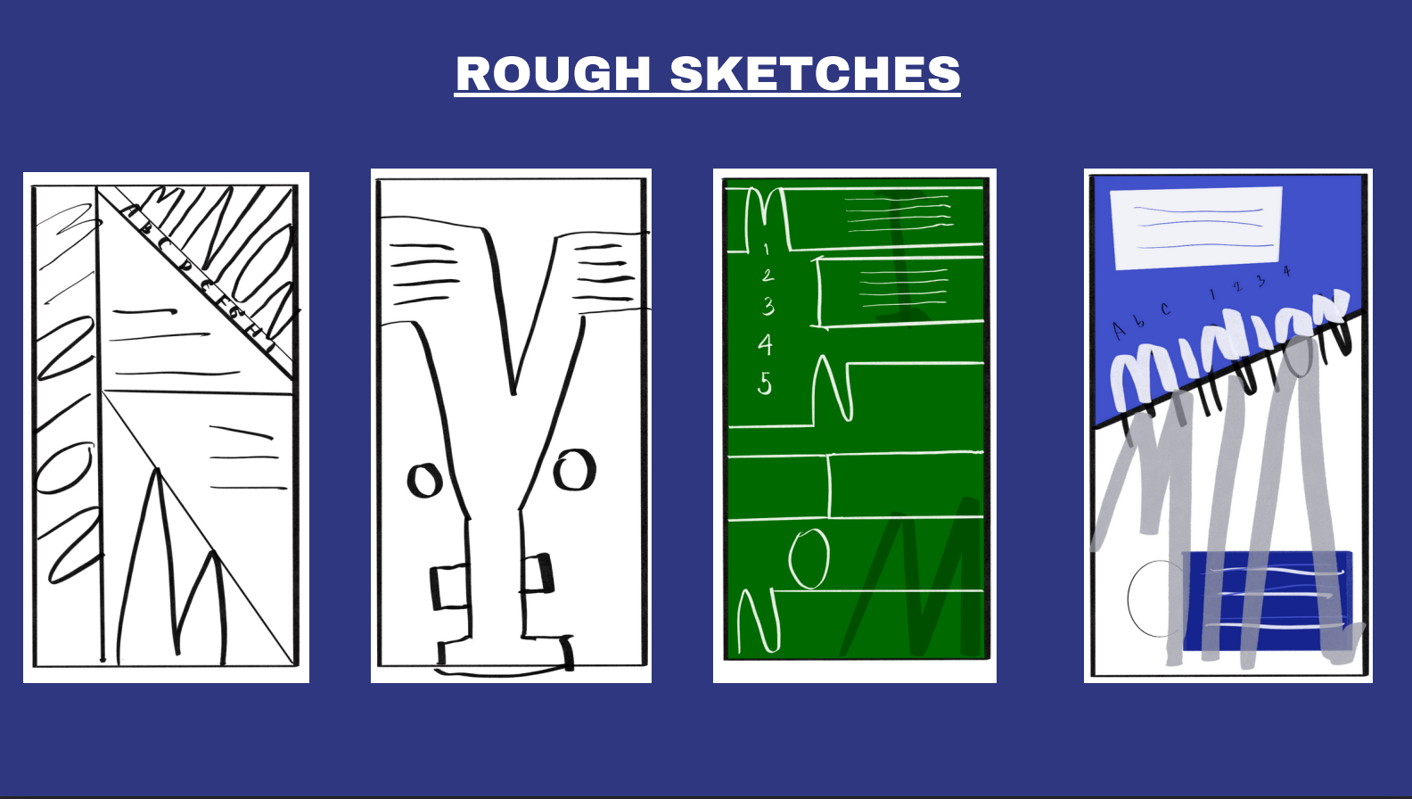
Process: I began by selecting the typeface "Minion," which I found particularly intriguing. After researching the history and background of this typeface, I moved on to the sketching phase, exploring different design ideas and concepts for the posters.

For sketching, I used Procreate on my iPad to create four rough sketches with simple colours that I wanted to try on the next step.
Afterward, I focused on creating rough digital versions of all the sketches I had drawn, paying close attention to the elements while adhering to the project brief. According to the instructions, no shapes or images were to be included in the designs.

For my final design, I chose this version because the colors are well-matched, and all the elements are organized effectively, creating a cohesive and visually appealing layout.